Cet
I’m a designer driven by simplicity, clarity, and purpose. I enjoy taking small ideas and shaping them into functional, engaging experiences—whether through branding, digital products, or UX-Design. My work is guided by functional aesthetics—design that solves real problems, creates delight, and remains relevant over time.

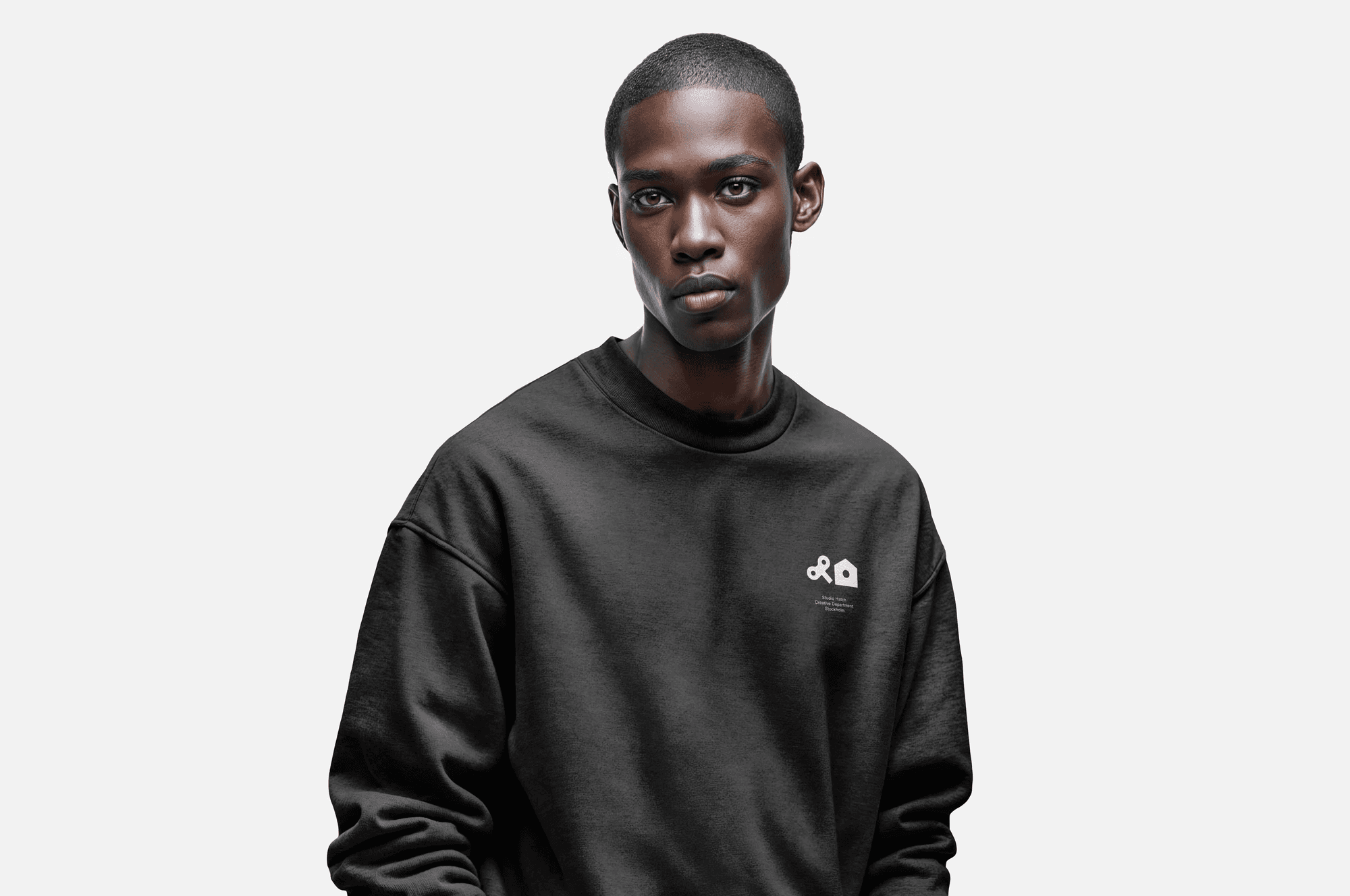
A cohesive employer brand and evolved visual identity system for Octapharma Sverige — building on the existing brand to create clarity, consistency, and flexibility across touchpoints.
Role
As Design Lead, I was responsible for:
– Defining visual strategy and design direction
– Aligning local and global stakeholders around a shared vision
– Establishing scalable design principles rooted in the existing brand
– Implementation across brand and assets
– Development of new visual components
Context
Octapharma Sverige is part of a global, family-owned biopharmaceutical company dedicated to improving human health through innovative, life-saving therapies. While the organisation had an established global visual identity, there was a clear need to further develop and extend it locally to better support employer branding and recruitment communication in Sweden.
Rather than creating a new identity from scratch, the ambition — and explicit request — was to evolve the existing visual identity and build upon it. The objective was to strengthen clarity, cohesion, and emotional engagement while remaining fully aligned with the global brand framework and preserving brand equity.
Strategic foundation
Through analysis of Octapharma’s existing brand assets, communication materials, and the competitive landscape within life science, we identified opportunities to clarify the visual hierarchy, strengthen consistency across touchpoints, and introduce complementary components that would increase flexibility without fragmenting the identity.
The strategic approach focused on evolution rather than reinvention — refining what already existed and expanding it into a scalable system tailored for employer brand communication.
Core idea
To develop a flexible, modular visual system that supports Trafikförvaltningen’s employer brand while maintaining alignment with Region Stockholm’s graphic profile. The system was designed to include a custom set of icons representing the organization’s operations, its people, and its purpose, enhancing clarity, coherence, and emotional connection across all touchpoints.
Visual identity system
The evolved system includes a refined typographic hierarchy, extended use of the existing colour palette, newly developed graphic patterns inspired by scientific structures, a custom illustration style, and a clearer photographic direction centred around collaboration, research environments, and the people behind the science.
Modular layout principles were developed to ensure adaptability across recruitment campaigns, social media, career pages, presentations, and internal communication. Clear guidelines were established to ensure that all new components integrate seamlessly with the original brand and support long-term scalability.
Outcome
The result is a strengthened and future-proof employer brand platform built on Octapharma’s existing visual identity. By evolving rather than replacing the brand, we preserved recognition and global consistency while increasing flexibility and creative range.
The system reduces fragmentation, enhances clarity across touchpoints, and enables a more engaging and cohesive employer brand presence — supporting long-term growth and talent attraction within the competitive life science sector.
Deliverables
Visual identity evolution
Employer brand guidelines
Extended graphic system
Illustration library
Photographic direction
Digital design system
Recruitment campaign assets

Promise

Photography

Outdoor

Illustration

Editorial Design

Onboarding kit

Illustrations

Digital Design

Digital Design

Social Media

Digital Design

Environmental Design

Outdoor
Regular Crewneck sweatshirt
Black